

With Orthojoy’s style scapes, we wanted to explore opposite ends of the spectrum when it came to concepts, moods, colours, tones, etc.
This was mainly done so that we could present the client with two radically different options when it came to the brand’s look & feel. This would help them view the brand under two different lights and ease the decision-making process.
One treatment adhered to a mood which was more traditional and showcased the bond among Indian families, specifically parents and their children.
The other was more inline with the outgoing independent individual, whose style embodies her personality.
Treatment 1 was finally selected.
WIREFRAMES:

These were some of the wireframes that were designed once we initiated the web
design process.
Presenting these wireframes to the client was a crucial part of the process, as they provided a visual blueprint of the website's structure and layout, which in turn would lead to a strong user interface.
They were also successful in shedding light on potential design issues early on, if any, so that the decision making process from our end and the client’s end got more streamlined later on as the website developed.
HOMEPAGE NAVIGATION & LOADER:


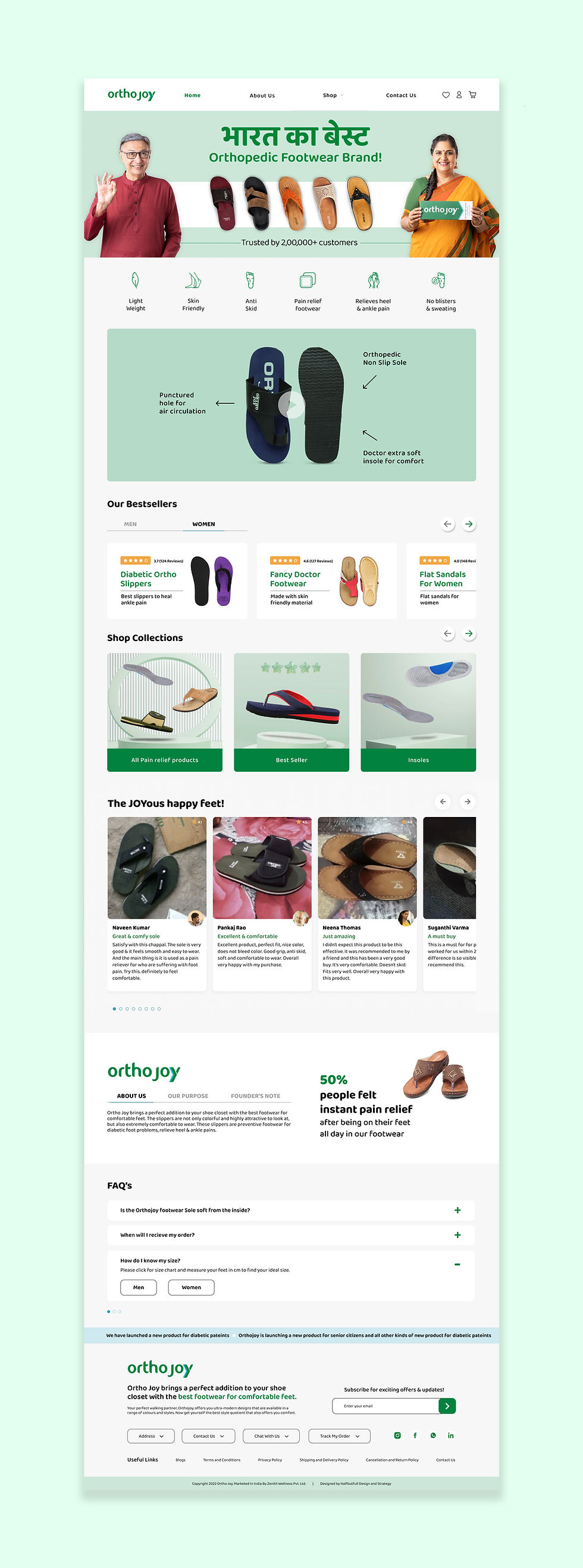
A well-designed home page is extremely important for a website, as it can make or break it. This is because it ends up becoming the first impression that a potential customer has of the brand. With this in mind, we went ahead with the design.
We wanted to make sure that important sections that could potentially lead to sales were efficiently added to it. Product catalogues, CTAs, and much more.
We were also aware that a mobile-friendly design approach had to be adopted since most customers shop online using their phones.
Also in a sea of millions of websites on the internet, creating a unique user experience
for the user can be a challenge.
But this is where the astute application of the custom logo loader can be a genius touch.
MOBILE PAGE NAVIGATION:

With the world operating on a mobile-first approach, laying out information efficiently on a mobile page is something we wanted to crack right out of the gate.
Hence, a well-designed mobile navigation system was created that was concise, easy to use, direct, and clear. We wanted to fill in the information on the page without making it a burden to read for the potential customer.
An efficient flow of information was created so that one subtopic flowed seamlessly into the other.
OVERALL FLOW OF PAGES:

With any website design, it’s always necessary to cover all the important details that the brand wants to showcase to its target market.
We understood the objective of the client, whose end result was to cover all the important bases that would satisfy the customer and eventually lead to a sale.
Keeping this in mind, detailed and clean designs were created for collection pages and product pages that have clear navigation and well-planned interfaces that would allow the customer to engage with the brand in a direct, to-the-point, yet aesthetically pleasing manner.

Anish Nagpal
Founder, Orthojoy
I was looking for a Shopify website for my D2C footwear brand, Orthojoy, when Halfbutfull reached out to me. I was impressed with their portfolio and their understanding of the e-commerce space. They worked closely with me to understand my needs and goals, and they delivered a website that exceeded my expectations.
The navigation is seamless, allowing our customers to effortlessly explore our orthopaedic footwear collection. The user journey is smooth, ensuring a delightful shopping experience. The design language perfectly captures our brand's essence, reflecting our commitment to comfort and style. Thank you, Halfbutfull, for bringing our vision to life!
