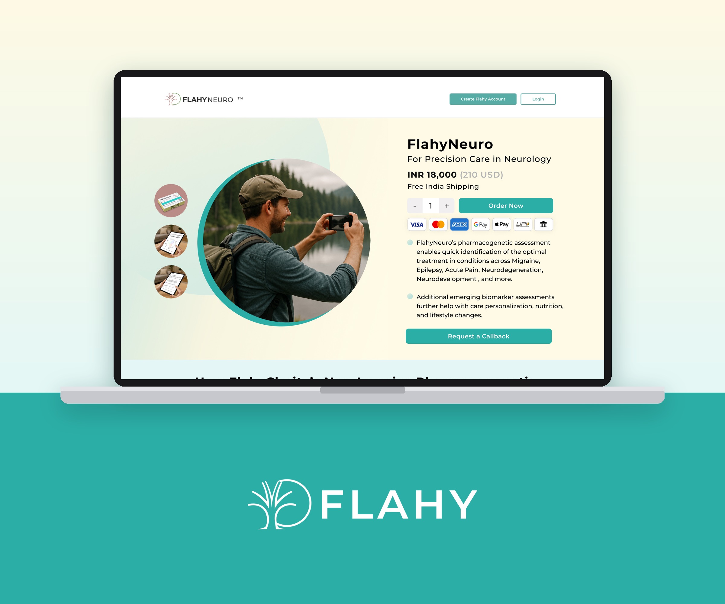
Flahy is a health technology company that reads your blood and your DNA together, so people and their doctors can see what to act on now and what to build on for life. We designed the Flahy website for desktop and mobile: the FlahyLife homepage, the FlahyClarity and FlahyNeuro test pages, the checkout, the report and the DNA signature.
- Category
- Health technology
- Scope
- Website design for desktop and mobile: homepage, three test pages, checkout, report and DNA signature, blog and contact
- Platform
- Custom build
The brief.
Flahy sells tests that read 65+ blood markers alongside your DNA, and pharmacogenetic tests that show which medicines are likely to work for you. The website had to explain all of that to two very different readers, people taking charge of their own health and the doctors who treat them, and it had to sell the tests online.
What made it hard.
The science reads like a lab report. Three tests speak to three different audiences: long-term health, mental health and neurology. Health websites tend to feel either cold and clinical or soft and unconvincing, and Flahy needed to feel warm while still being trusted. And a medical test bought online needs a checkout people feel comfortable finishing.
Colour system.
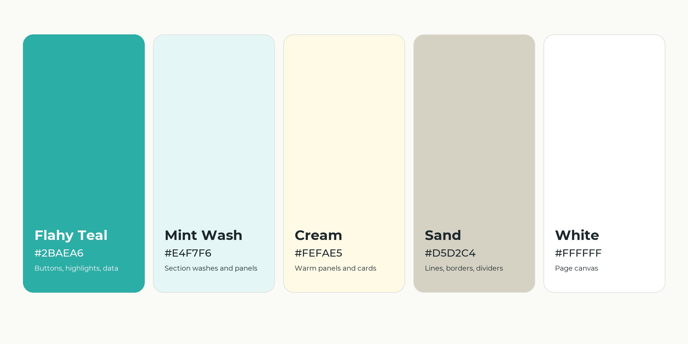
Five colours run the site. Flahy Teal for buttons, highlights and data, Mint Wash and Cream for calm section washes, Sand for lines and dividers, and white for the page.
Typography.
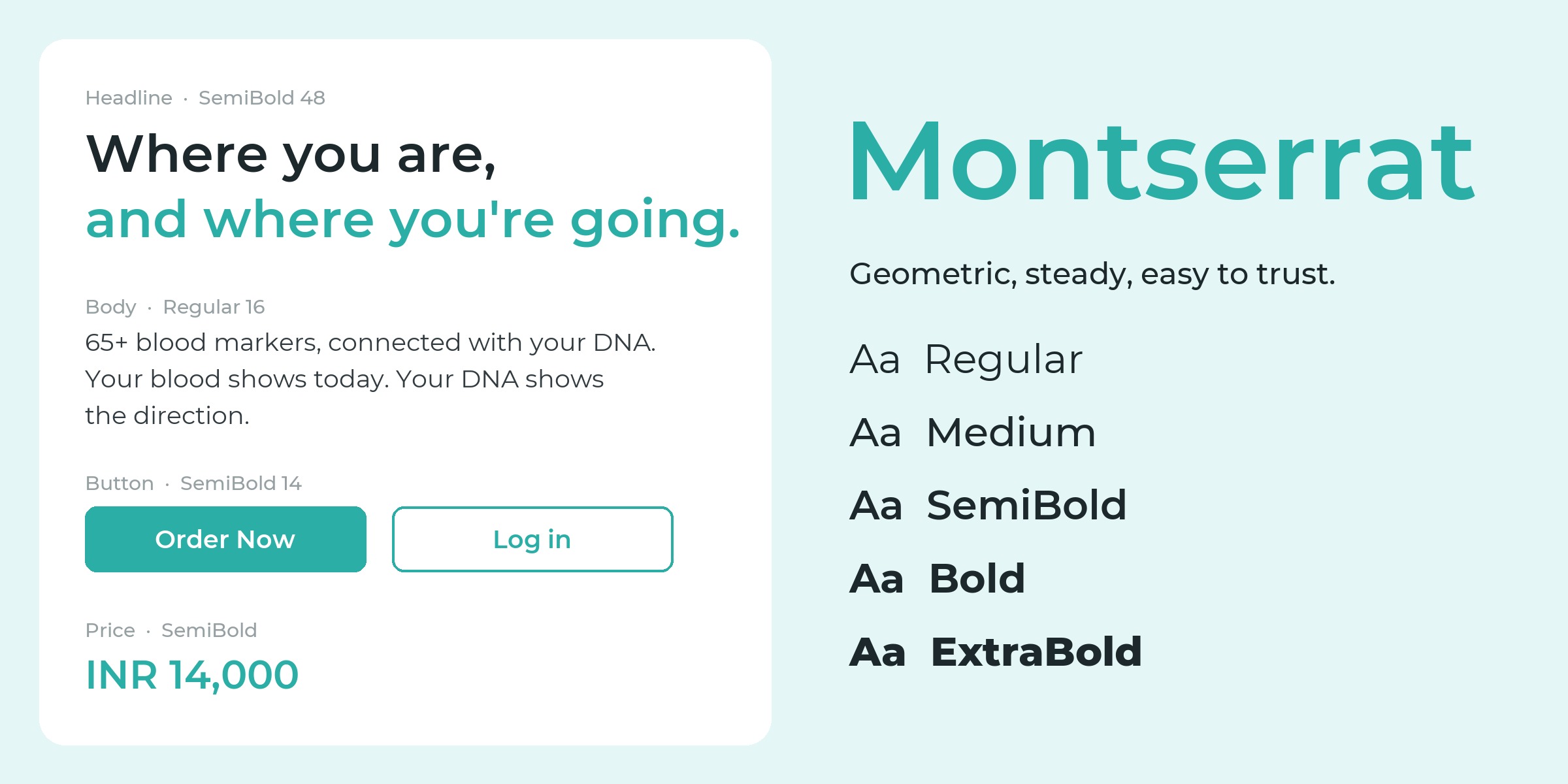
Montserrat throughout, from SemiBold headlines to Regular body text. Geometric and steady, so dense information still feels easy to read.
How we solved it.
Every decision came back to one question: will someone with no medical background understand what to do next?

The homepage on mobile.
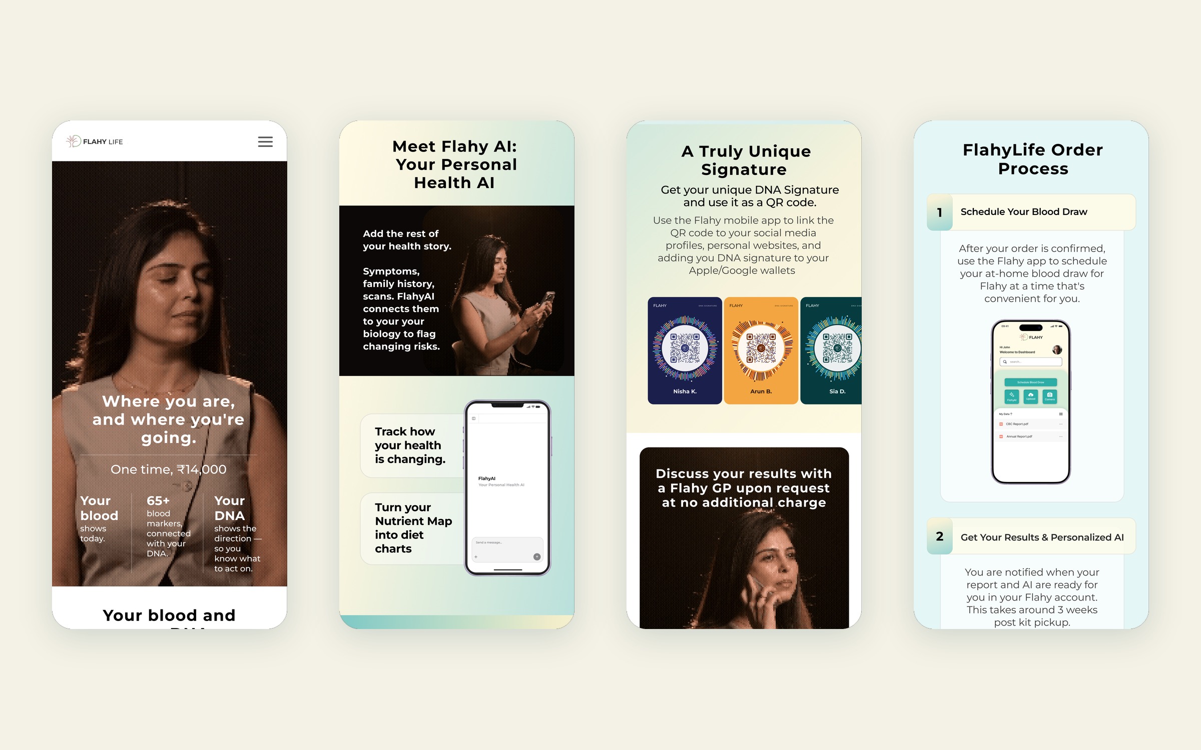
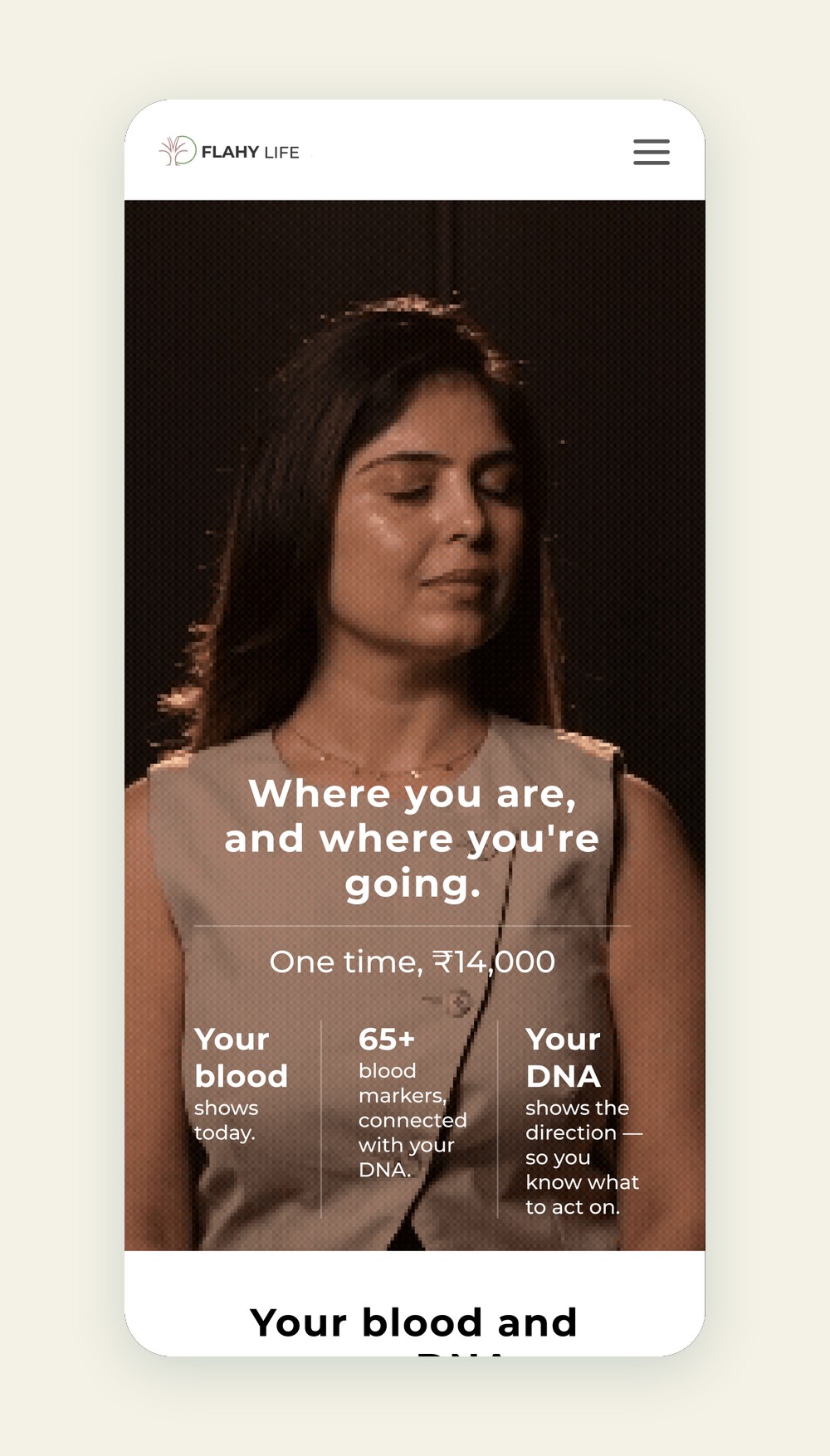
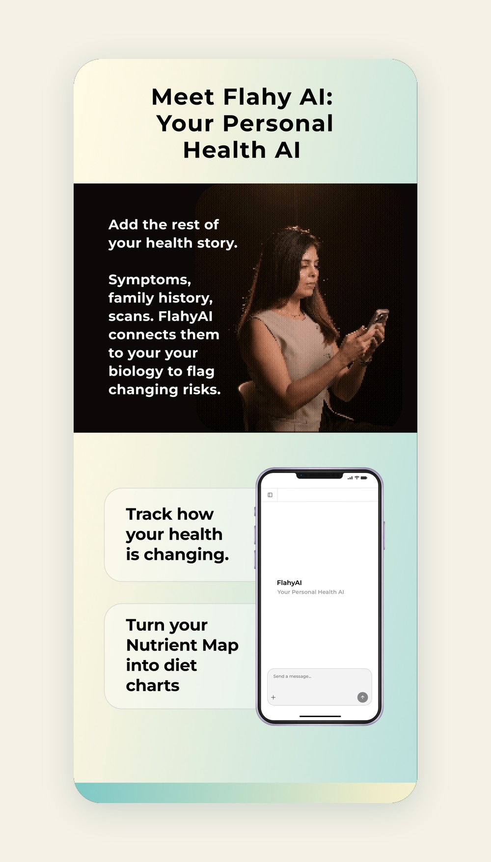
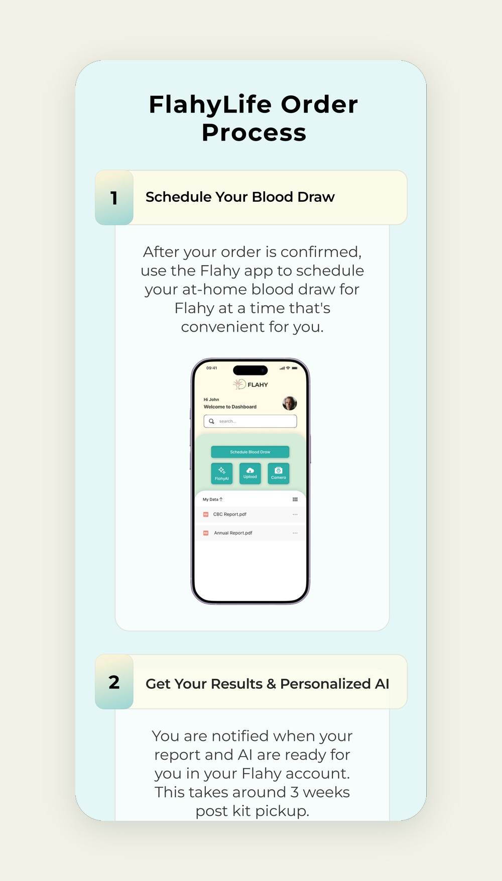
Most visitors arrive on their phones. The homepage moves from the promise, to how blood and DNA work together, to Flahy AI, to what you get and how to order.
Three tests, one system.
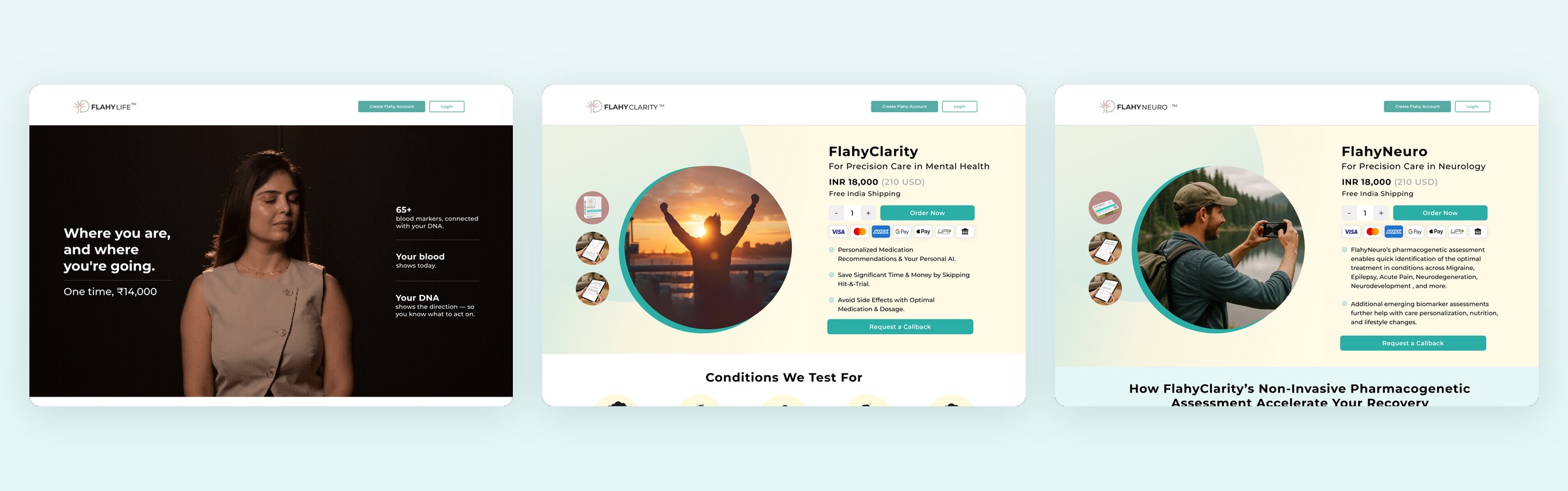
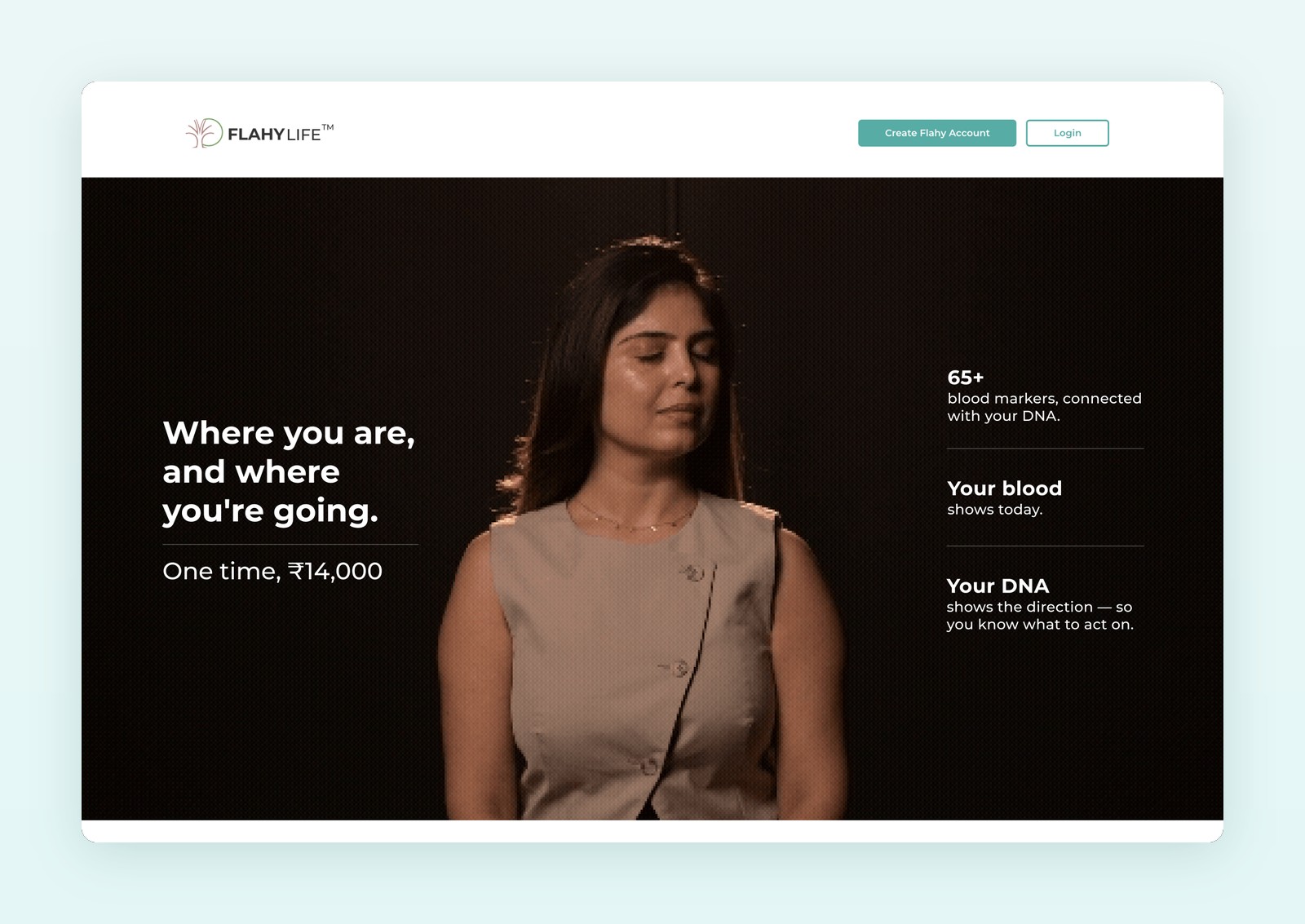
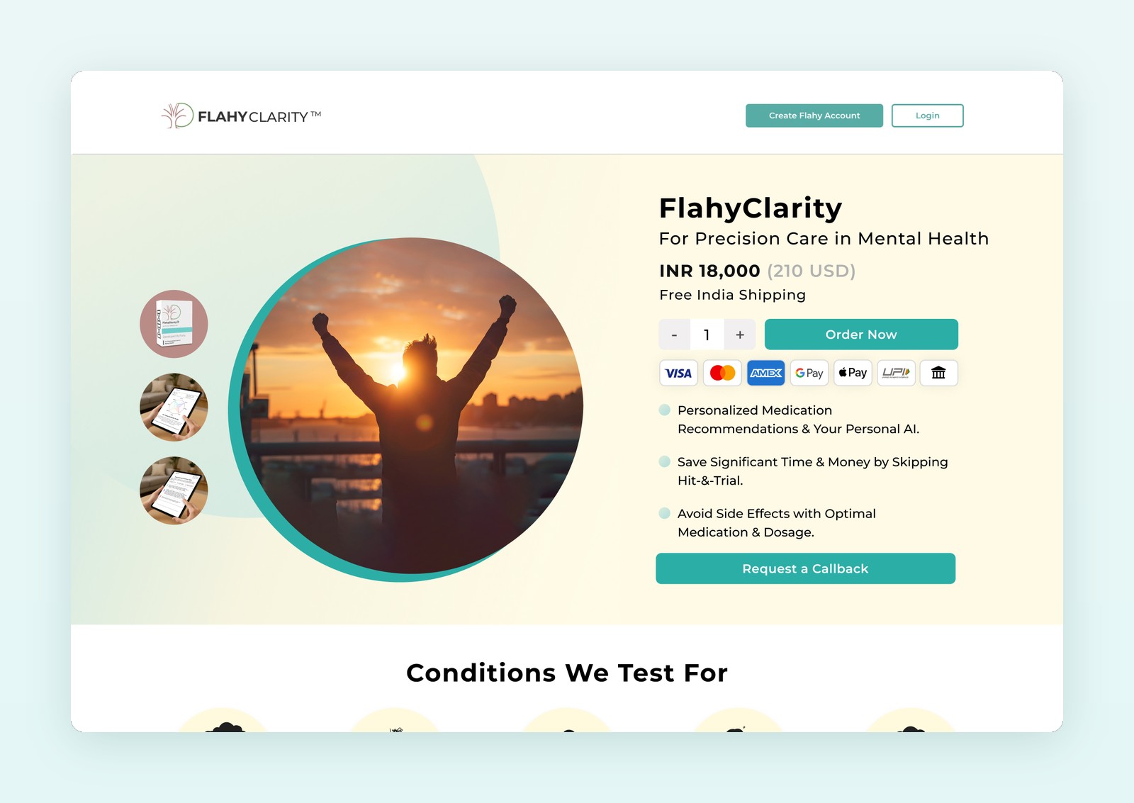
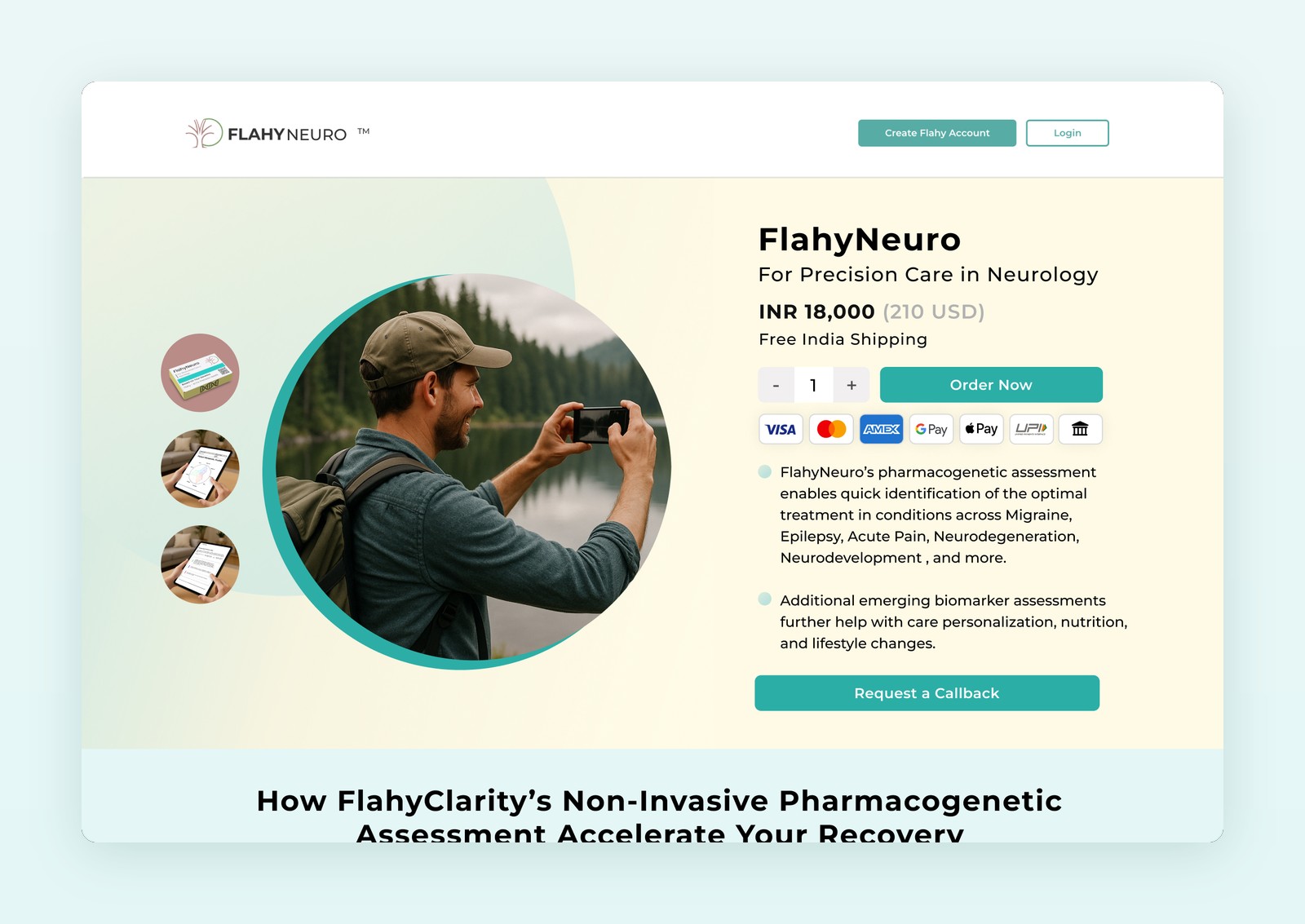
FlahyLife for long-term health, FlahyClarity for mental health and FlahyNeuro for neurology. Each page speaks to its own reader, but the layout, colours and order flow stay the same, so Flahy always reads as one company.
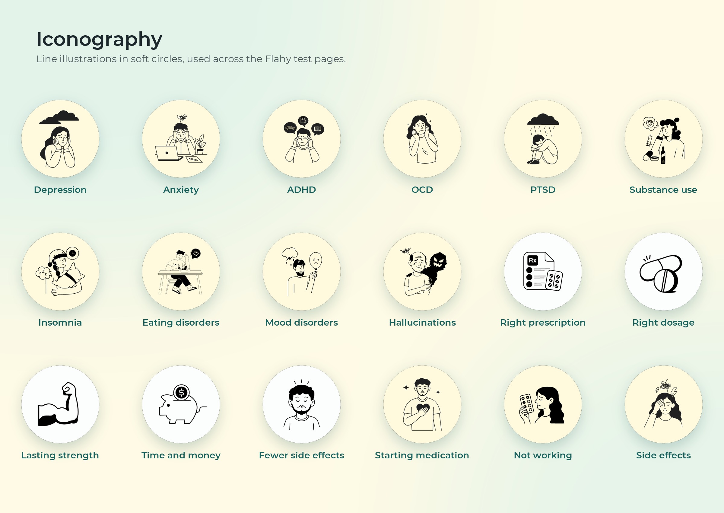
Iconography.
Line illustrations in soft circles explain conditions, benefits and who each test is for, so a page about pharmacogenetics never feels like a textbook.
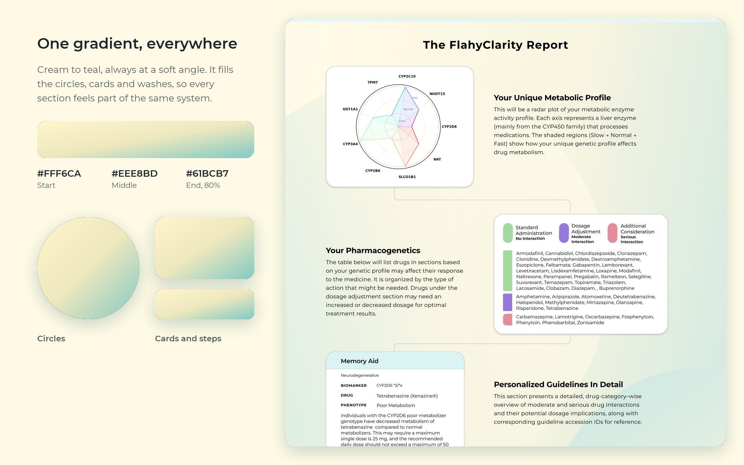
One gradient, everywhere.
A cream to teal gradient and large soft circles sit behind cards, steps and the report. It is the quiet pattern that makes every Flahy page recognisable.
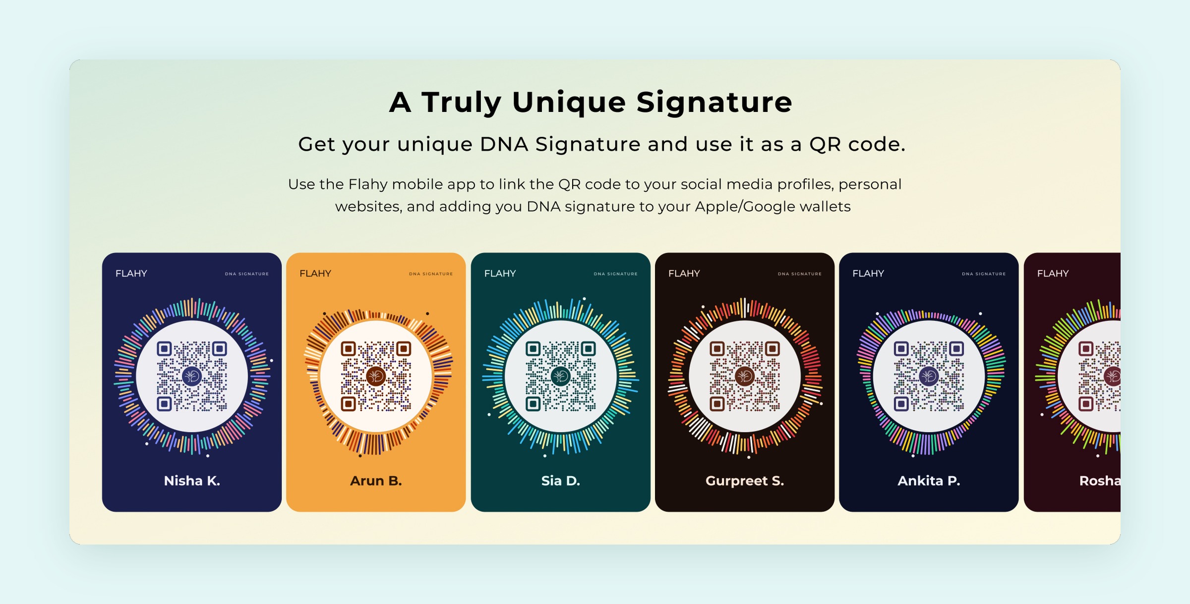
A result worth sharing.
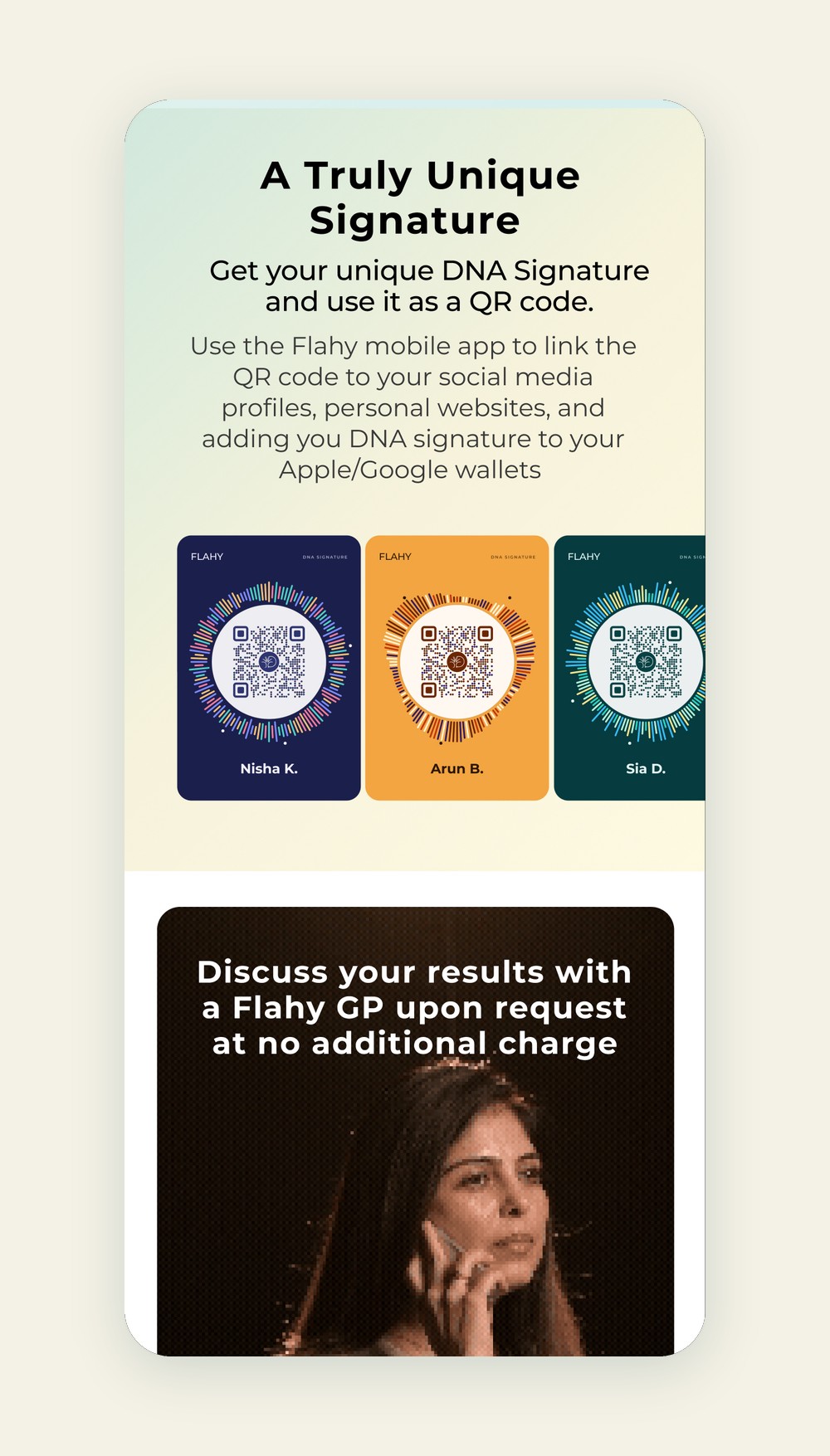
Every Flahy member gets a DNA signature, a unique pattern that doubles as a QR code for profiles and phone wallets. We designed it to be the part of a health report people actually want to show.
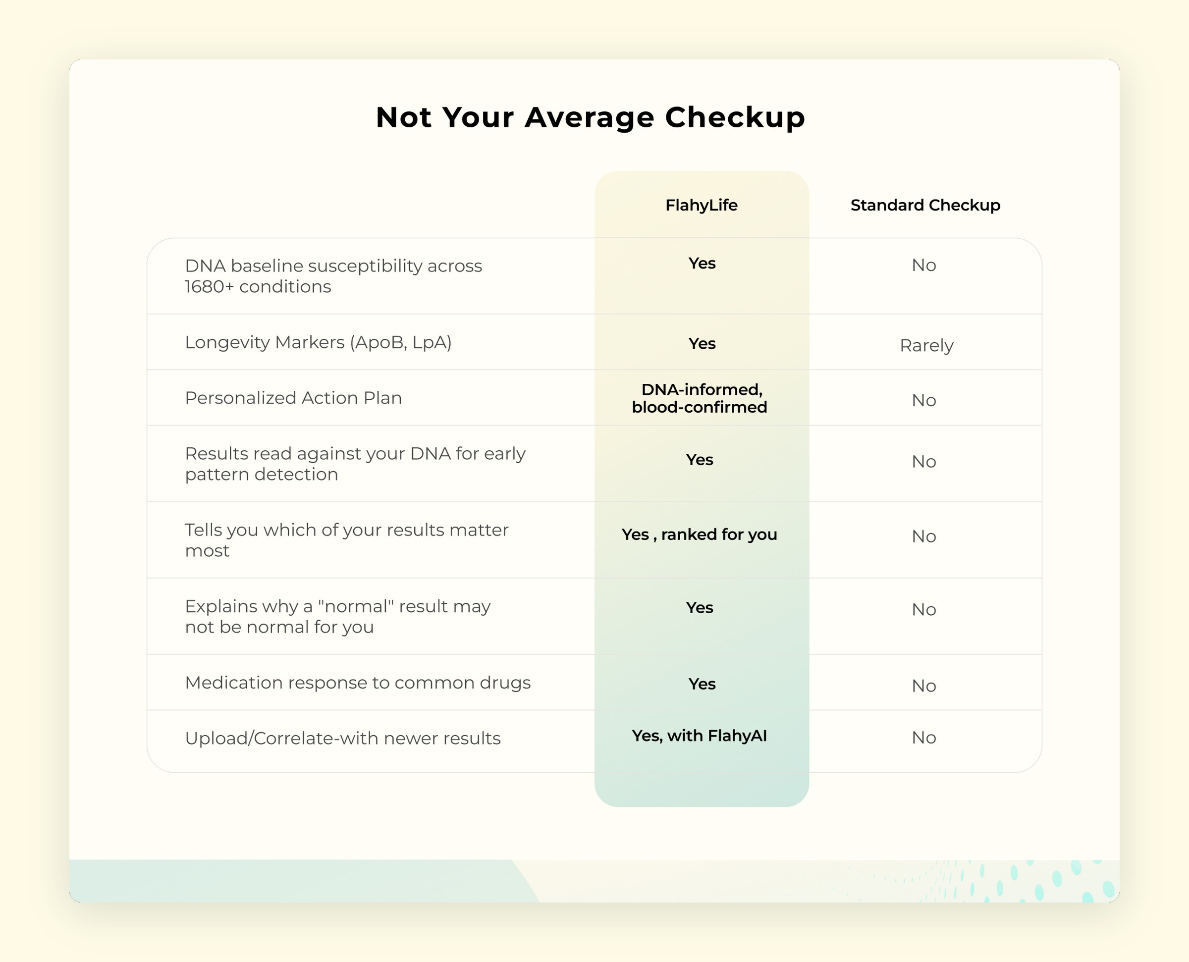
Making the data readable.
A side by side comparison with a standard checkup shows what Flahy adds at a glance, instead of a page of claims.
Ordering a medical test online.
Four clear steps from account to payment, with the order summary always in view and a separate path for shipping outside India.