Amama is a handcrafted jewellery and accessories brand from Noida, founded by Nikita Gupta in 2018 and grown into more than fifty collections with a workshop of its own. They came to us with a homepage people were leaving after the first scroll.
- Category
- Handcrafted jewellery
- Scope
- Mobile-first homepage, product page, collection page and menu
- Platform
- Shopify

The brief.
Amama's average order sits between ₹4,000 and ₹6,000. About a fifth of revenue comes from buyers abroad, and around 40% of customers come back to buy again. The site had to feel premium without feeling like fine jewellery, serve shoppers in India and overseas from one homepage, and make the metal and price of every piece obvious.
What was getting in the way.
Buttons that were easy to miss. The metal and karat never stated on the product cards. Collections shoppers had to decode before they could browse. A homepage that showed a lot but led nowhere.
How we worked.
We studied jewellery stores that already handle heavy traffic and kept only what was proven. Then we checked every decision against Amama's own heat maps before designing a single screen.

Three design decisions.
Shop by category first, because that is how people look for jewellery. The metal named on every product card. And on every product page, price, offers, Add to Cart and Buy Now sit above the fold.

Finding a look that feels young.
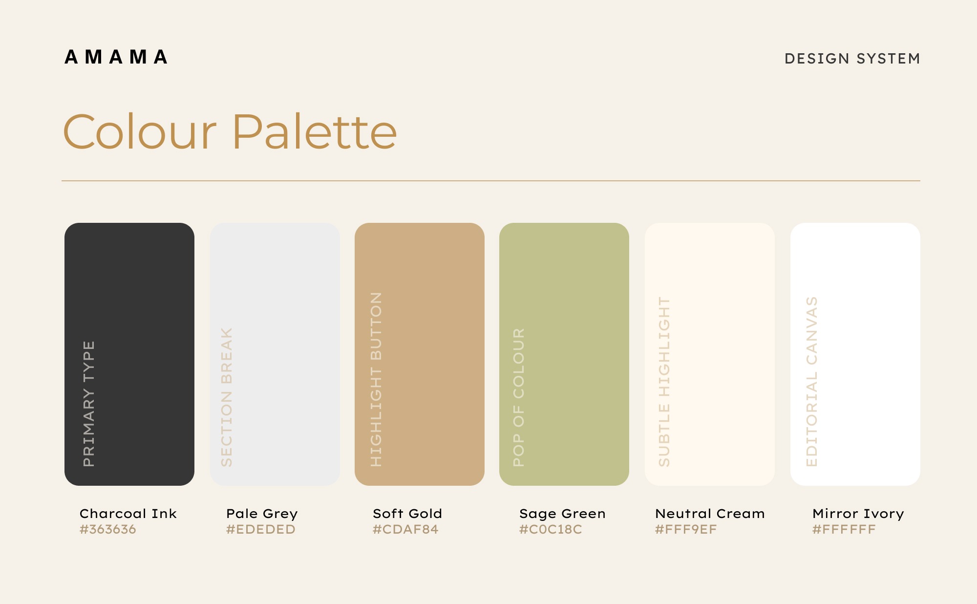
Black and gold felt too dark and too fine-jewellery. Green and grey fought with the campaign photography. We landed on a white canvas with Soft Gold and Sage as accents, so the photographs do the talking.
Colour system.
Six colours run the palette: Charcoal Ink for primary type, Pale Grey for section breaks, Soft Gold for highlight buttons, Sage Green as the pop of colour, Neutral Cream for subtle highlights, and Mirror Ivory as the editorial canvas.
Typography.
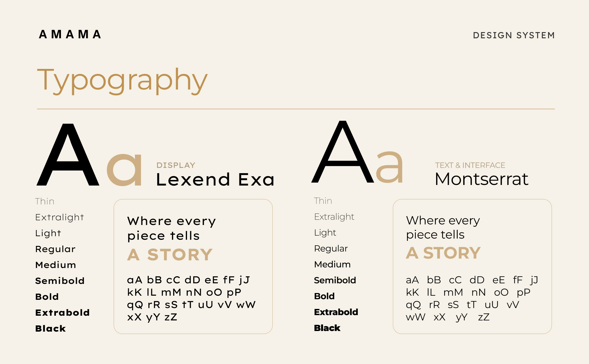
Lexend Exa sets the display headlines, Montserrat carries everything else, with weights from Thin to Black for hierarchy.
The homepage in motion.
The finished homepage on mobile, scrolled the way a shopper would, followed by the desktop storefront.
“We love how the homepage flows. It brings forward more of our products and special collections, and the videos sit exactly where they should.”